
Sunday, March 30, 2014
Jacs March Letters
Here are the letters for March
I've just realised I put the W upsidedown on the scanner (I've already done M)
Saturday, March 29, 2014
April Letters


Friday, March 28, 2014
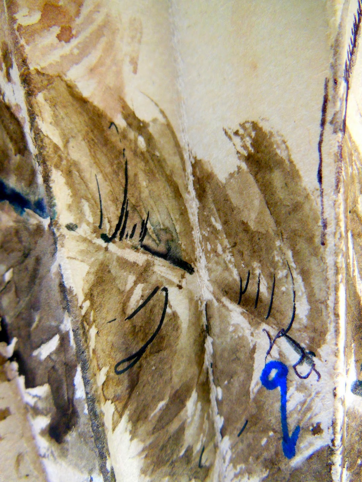
Map letters for March
I decided to hop across to Ireland for the K. I was trying to choose places where the place name was enlarged on the map.
J-Jedburgh
 K-Killarney
 L-London
 M-Manchester

and on the reverse
 Sorry for the blur.
J-Jedburgh
and on the reverse


I'm on Spring Break from my teaching, so I've had a bit of extra time to play and have completed the Place Alphabet tiles. I've made 2 sets of tiles and mounted them into accordian books to give to my son and daughter to share with the grandchildren. I might make some quick photocopies and put a copied version together to keep for myself.
Thursday, March 27, 2014
FROM A BIRD'S PERSPECTVE


 Chooks, Red Tailed Cockatoo, I very rarely hear or see a Glossy Black Cockatoo, Currawongs, Drongo, coloured finches hiding in the grasses.....so many feathered delights flitting between the trees. I know why we chose this "place". Apologies "n" missed the film shoot. Was a little shy when I took the photo....hid behind a tree!
Here are some more cat breed letters. M is Mustachio for long side whiskers. Nainsook cats have very soft coats the color of muslin. Ombre coats are shaded from dark in the front to light toward the tail. Wouldn't that be beautiful! And my favorite word so far is Pyknic for short and powerful.

I had a lot of trouble drawing N and may redo it.
Thanks for looking, Anita
Wednesday, March 26, 2014
February Letters Flowing in March

After an overseas absence, here is the latest offering of letters.
Choosing the right twig for each letter is both challenging and rewarding, especially where curves are required.
 The
gentle fragility of each piece embraces a flexibility when introduced
to another of nature's elements, water. The process and the outcome a
rewarding reminder of the magical alchemy of nature.
The
gentle fragility of each piece embraces a flexibility when introduced
to another of nature's elements, water. The process and the outcome a
rewarding reminder of the magical alchemy of nature.

lettres de mars
Hello !
Here are my four letters for march :
C
 for CANA
D for dicentra spectabilis, that is coeur deMarie in french and bleading heart for you


Here are my four letters for march :
C
D for dicentra spectabilis, that is coeur deMarie in french and bleading heart for you
M for magnolia
V for Violette
At the moment it is the begining of spring in France and we had very beautiful days. Flowers and birds are more and more numerous, the magnolia prospered butits flowers have already faded
Next April !!!!
Annik
Saturday, March 22, 2014
leaf letter book
Onwards my letters march ... in March!

Trying out the woodblocks on my drawing board.


April comes ...
P, Q, R

A for Apple
My baby quilt is coming along. I'm actually going to the baby shower
today, to present what I have to the expectant mother as a promise that
it is coming :) I got stuck into it a couple of weeks ago and laid out
most of the quilt top, with backing fabrics for the letters that I
haven't done yet. It is going to be bright and cheerful!
Here is the next one: A for Apple

I was also not sure about my F for Fish block, whether it was clear enough, so I've done a second: F for Flower. Just in case the first one doesn't work.

Here is the next one: A for Apple
I was also not sure about my F for Fish block, whether it was clear enough, so I've done a second: F for Flower. Just in case the first one doesn't work.
Friday, March 21, 2014
A change of season...

Hello again. This is my second round of letters for the free alphabet, which is inspired by the English 111 Vivace font (more on how they came to be in my first entry).
As I gathered these latest letters to photograph today I realized that the "palette" seems to have evolved as we've moved from winter toward spring. With their deeper colors & splashes of orange (psychological warmth for dreary afternoons), the earlier ones of this new group reflect the mood of the cozy indoor days of that period—whereas the most recent ones (shown further along in this post) feel more like spring...

 |
| "S" |
 |
| "Z" |
 |
| "B" |
The colors of both the photos & the individual 7x7-cm designs seem to be playing tricks when I post them here; the colors of the boxes are a bit off, as are those of the designs themselves (some too bright, others to dull). Unfortunately I can't seem to compensate in either case!
Anyway, back to the letters... I find I am continuing to learn as I go along. For example, the rather diminutive 7-cm size means that some of the detail gets lost/is too much at that modest scale. And sometimes the result can be pretty intense when I layer the letter designs, which have transparent backgrounds, over a colored background (as with the "B"). The process has been quite addictive, and I have gone on to create additional designs or patterns that extend around some of the box sleeves.

Sometimes the colors of the week's letter draw inspiration from something specific; as described in this post, "S" came about from a teapot & mug, and "M" (below) from the mimosas given locally for la festa della donna (International Women's Day) on 8 March. I created an e-card with M-inspired & G-inspired designs (shown in this post), to try and capture the feeling of spring. In my latest post you will see what I decided to put in the "M" box.
 |
| "M" |
 |
| "G" |
 |
| "L" |
*
Happy Spring to all of you in the northern hemisphere +
here's wishing golden autumn-y days for those of you south of the equator.
And to all: happy letter-making...
Subscribe to:
Posts (Atom)